

TL;DR
- Google is working on a design overhaul for Android 16.
- An early look at its design changes has surfaced online.
- Design of Quick Settings Panel, Icon shapes, and more are seen.
Following the release of the 4th Beta of Android 16, many enthusiasts expressed disappointment over the minimal changes to the user interface. As this Beta was the final one, it suggested that no significant UI updates would be forthcoming, similar to previous iterations. However, recent information from Android Authority indicates that Google is preparing a major redesign for smartphones running Android 16, promising a range of design modifications that will provide a fresh appearance.
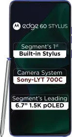
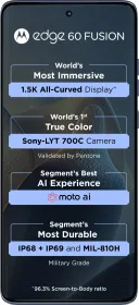
ALSO SEE: Top 6 Moto Edge 60 Pro Alternatives You Can Buy Right Now
Android 16 to get a major design overhaul
Android Authority has listed various design changes that are expected to become a part of Android 16 UI soon.
1. Redesigned Status Bar

The report indicates that the status bar will undergo a redesign featuring a newer, bolder font for the 5G indicator, with the clock being moved to the left side and appearing larger than in Android 15. Additionally, the company plans to update the battery and charging icons to align more closely with those found in iOS. Icons for WiFi, Mobile Data, Airplane mode, and others are also set to be modified. The new battery icon will be more vibrant, displaying a green background while the device is charging. Furthermore, the font used for the text clock will be larger and bolder than previously, enhancing its readability.
2. Redesigned Notifications & Quick Settings Panel

This represents a major update to the Quick Settings and Notifications panel. It will feature a consolidated toggle for WiFi and Bluetooth, an improved tile editor, resizable Quick Settings tiles, and a simplified method for adding or removing tiles. Additionally, there will be one-click toggles for WiFi and Bluetooth, among other enhancements. The brightness slider will also undergo a redesign. While the basic layout may remain consistent, the overall aesthetic will be refreshed. The panel will showcase a blurred effect of the underlying content, with a subtler blur beneath the Quick Settings tiles compared to the notification area. In light mode, the background will adopt a frosted glass look.
3. App Drawer getting Blue Effect

Google intends to introduce a blurred background effect in the app drawer of the Pixel launcher, the PIN entry screen, and the Recents Menu. At present, these sections feature a solid light or dark gray background based on the selected system theme. The PIN entry screen now displays dynamic colored dots for each number, utilizing Material You theming. Additionally, the numbers have been enlarged and bolded, resembling the updated font used in the text clock.
ALSO SEE: 10 Best Tower Fans to Buy In India this Summer Season (2025)
4. Cleaner, Compacter Screen

Google is set to introduce a new Compact Notification shelf that consolidates all notifications on the lock screen. This optional feature presents a small translucent button in the lower left corner beneath the clock, along with contextual information displaying all notifications. When there are no notifications, it remains at the top, but moves below the clock when notifications are present. Additionally, the date and weather details adjust to sit under the time, contributing to a more streamlined appearance.
5. Less Bubbly Volume & Media Output UI

Google is updating the volume user interface by replacing the bulky sliders with sleeker versions that include unique handles. This redesigned slider is more in line with Google’s current Material Design 3 principles, suggesting it will remain consistent with the forthcoming Material 3 Expressive theme. Additionally, the volume slider that activates when the volume key is pressed is being modified to have a less rounded appearance and a slim rectangular handle. The sound mode selector has also been refined, and the media output switcher in Android is set to undergo a redesign.
6. More Expressive Settings App

Google is revamping the Android Settings App to incorporate the new Material 3 Expressive design language. This redesign will introduce several visual updates, including the return of vibrant icons on the homepage, individual cards for each menu item, and right-facing arrows to signify subpages. Additionally, the page header will be positioned at the top by default, allowing for greater visibility of items upon entering a settings page.
ALSO SEE: Best Alien Sci-Fi Movies to Watch on Netflix India (2025)
7. Redesigned Icon Shapes

Finally, Google is set to introduce exciting new icon shape options for the Pixel Launcher. While full customization of icon shapes on the home screen won’t be available, users will have the choice of five new shapes: square, four-sided cookie, seven-sided cookie, arch, and complex clover. The current default icon shape is a circle, but the new options will feature both less rounded and more intricate geometric designs. These icon shapes will also be reflected in the app drawer.
The recent design modifications observed thus far are concealed changes identified in Android 16 Beta 4. None of these modifications are activated by default in Beta 4, and there is no certainty regarding when Google will implement them. It is improbable that a full redesign will be present in the stable version of Android 16; however, some elements may be introduced in a quarterly update. Further details are anticipated next month at the Android Show or Google I/O 2025, where Google intends to present a new, more expressive iteration of Material Design, referred to as Material 3 Expressive.
You can follow Smartprix on Twitter, Facebook, Instagram, and Google News. Visit smartprix.com for the latest tech and auto news, reviews, and guides.